
Nicely looking text is always a great addition to your design. You may have seen this style around the web and it is very easy to make. It’s perfect for welcome text, logos, and headers.
Began with making some text (or apply this to any current text you have), fonts that are thicker work better for this technique since it’s more noticeable.

The main styles used in this tutorial are Shadow, Inner Shadow, and Gradient Overlay.
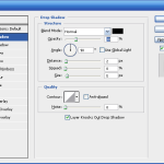
Add a subtle shadow that points down, I used 2px distance, 5px size, and 30% opacity.

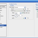
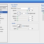
After adding a shadow you will need to add a white inner shadow that is 1 pixel in size. Along with a gradient overlay that goes from white to grey.

Here are a few tweaks that I tried.

Inspiration for this style can be found all over but I saw it on FreelanceSwitch. Note that FreelanceSwitch uses “Futura” for their logo font.

nice..! lets try..!